

High-Converting Landing Page Structure for SaaS: A Developer's Guide
The page structure that turns visitors into customers.
Prashant Khuva
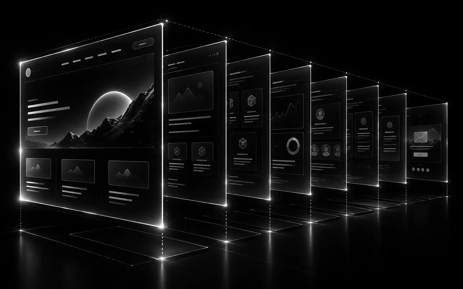
High-converting landing pages follow one order: headline, problem, solution, proof, CTA. Above-the-fold clarity converts 40 percent better than feature lists, and social proof placed right after the solution lifts trust when skepticism peaks. One page, one goal.
This developer's guide breaks the page into eight sections — hero, problem, solution, social proof, process, pricing, FAQ, and final CTA — with the copy pattern and structure that make each one convert.
Key Takeaways
- Pass the 5-second test: what you do, who it's for, why care — visible without scrolling.
- Frame features as outcomes ("ship in 4 weeks", not "built with Next.js").
- One primary CTA, repeated — never split attention between two actions.
- Place social proof immediately after the solution, where skepticism is highest.
What Makes a Landing Page Convert?
A high-converting landing page does three things in sequence: captures attention with a clear promise, builds trust with evidence, and removes friction from the next step. Most SaaS landing pages fail because they focus on looking impressive instead of guiding visitors toward a single action. The structure below is what converts — it works because it follows how people actually evaluate software.
Conversion rate is the percentage of visitors who take the desired action. Above the fold is the content visible without scrolling on first load. CTA is a call to action, the button or link that drives the next step.
Section 1: Hero — The 5-Second Test
The hero section must pass the 5-second test — a quick check where a visitor understands what you do, who it's for, and why they should care in 5 seconds or less. Structure: headline (what you do in plain language), subheadline (who it's for + key benefit), one primary CTA (Call to Action) — a clickable element like a button or link that prompts visitors to take the next step, such as signing up or booking a call — and a supporting visual (product screenshot or short demo video — not a generic illustration). For example, 'SaaS MVPs for Funded Startups. Ship in 4-6 weeks, not 6 months. [Book a Free Strategy Call]'.
Section 2: Problem — Agitate the Pain
Before showing your solution, make visitors feel the problem. Describe the specific pain your audience experiences: 'Your MVP has been in development for 4 months. Your runway is shrinking. Competitors are launching.' Use 2-3 short statements that mirror what your ideal customer is thinking. This creates emotional investment before you present the fix.
Section 3: Solution — How You Fix It
Now introduce your product as the answer to the pain you just described. Show 3-4 key features or capabilities, but frame them as outcomes, not technical specs. Instead of 'Built with Next.js and Supabase' say 'Production-ready auth, billing, and database — configured in days, not months.' Include a product screenshot or short demo GIF showing the core workflow.
Section 4: Social Proof — Evidence That It Works
Place social proof — evidence that other people trust and benefit from your product, such as testimonials, client logos, review scores, or case study snippets — right away after the solution. This is where skepticism is highest. Use 3-5 specific testimonials with real names, titles, and companies. Add measurable results: 'Launched ahead of schedule' or 'Cut development time significantly'. If you have client logos, show them here. If you don't have testimonials yet, use case study snippets, review scores, or a client count. Strong CRO (Conversion Rate Optimization) — the practice of increasing the percentage of visitors who complete a desired action — depends on placing proof where decisions happen.
Section 5: Process — How It Works
Show your process in 3-5 simple steps. This reduces anxiety about what happens after they click the CTA. For example, '1. Strategy Call → 2. Proposal in 24 hours → 3. Build in 4-6 weeks → 4. Launch with support.' Each step should have a short description and an icon. The goal is to make the engagement feel structured and low-risk.
Section 6: Pricing — Transparency Builds Trust
If you sell services, show starting prices or pricing ranges. If you sell software, show plan tiers. Transparent pricing qualifies leads (people who can't afford you self-select out) and builds trust with those who can. Include a comparison table if you have multiple tiers. Always include a 'Book a Call' or 'Talk to Us' option for custom requirements. For billing pages and subscriptions, clear Stripe integration reduces friction at checkout.
Section 7: FAQ — Overcome Final Objections
Add 5-8 FAQs that address the most common reasons people don't convert: pricing, timeline, tech stack, support, and guarantees. Each answer should be 2-3 sentences — direct and specific, not evasive. For example, 'How long does it take? Most SaaS MVPs launch in 4-6 weeks. We give a precise timeline after our free strategy call based on your feature scope.'
Section 8: Final CTA — Close the Loop
End with a strong CTA that mirrors the hero. Repeat the core value proposition and make the next step crystal clear. 'Ready to ship your SaaS? Book a free strategy call — we'll scope your project and give you a timeline, no strings attached.' Add urgency if genuine: 'We take on 2 new projects per month — currently 1 spot left for September.' The structure above is the same one behind our landing page design service.
This guide is maintained by the Meteoric team. About us · Services · Contact · Editorial review by Prashant Khuva.
FAQ: SaaS Landing Page Structure: 8 Sections That Convert
Sources: SaaS Landing Page Structure: 8 Sections That Convert
Written by
Prashant Khuva
Founder & Full-Stack Developer at Meteoric. Building SaaS products and high-performance web applications for startups. Editorial policy for this blog.
Keep reading
Related reading: SaaS Landing Page Structure: 8 Sections That Convert



Meteoric
Have a project in mind?
From landing pages to full SaaS platforms — let's build something exceptional.